Case study · Self-initiated
Pathfinder Design System
A concept design system carried end to end, from a brand decision to shipped tested code, in a single day.
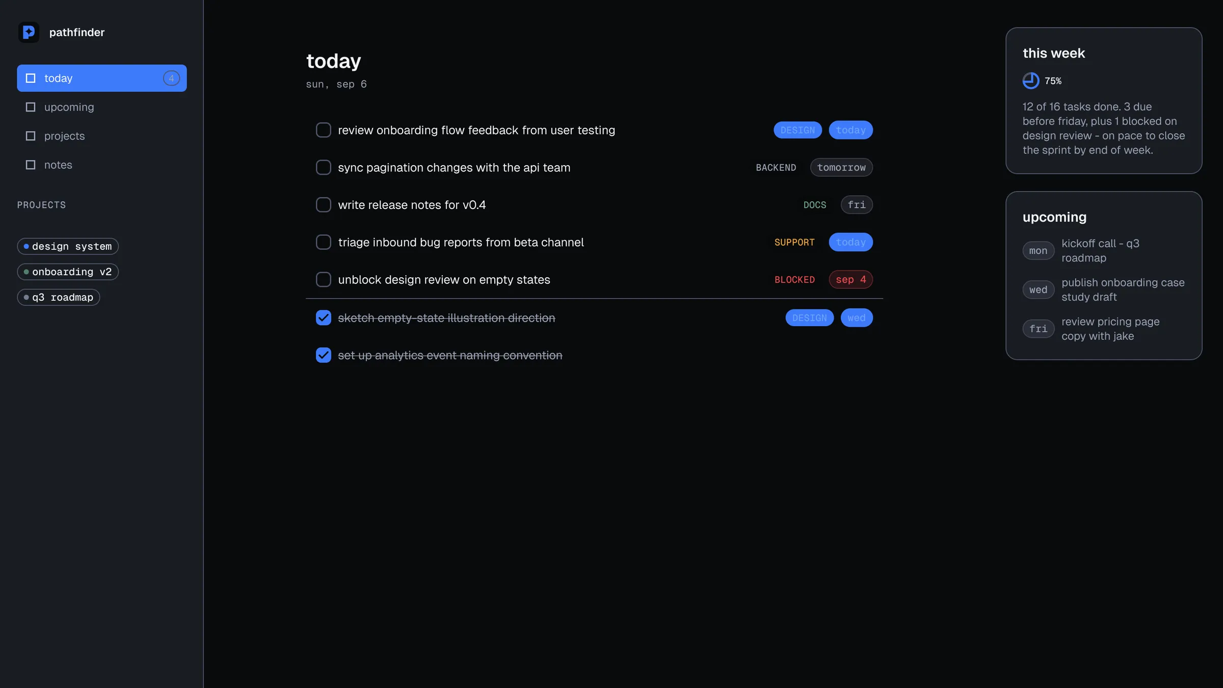
See it live
The challenge
Most design system portfolio pieces show either the Figma file or the shipped code. Almost none show the seam between them. That seam is where systems actually break. A value reads fine in Figma and fails contrast in a real browser. A rule holds on a dark canvas and was never checked against light mode. A component gets specced and never built.
So I set myself a constraint that couldn’t be satisfied by polish: invent a brand, build the token pipeline, build the Figma library, build a coded layer that genuinely consumes those tokens, and log every decision along the way. If the seam leaked anywhere, the log had to say so.
Why a planner app that doesn't exist
Pathfinder is a planner for people who navigate their work rather than just list it. The imagined user holds a lot of parallel threads and needs to see, in one glance, which of them is actually due today. That’s why the system’s center of gravity is the task row and the date chip rather than a dashboard. The product’s whole job is telling you where you are, so the components that answer “what now” get the most attention and everything else stays quiet behind them.
Choosing a fiction rather than a client was a deliberate trade, and it’s worth being clear about which half I gave up.
- No NDA, so every decision including the wrong ones could be published.
- No legacy system to inherit, so the token architecture could be designed rather than retrofitted.
- No stakeholder queue, so a single-day sprint was actually possible.
- No users to be wrong about.
- No analytics to contradict my taste.
- Nobody to negotiate with.
Every hard call here was a craft call, not a product call. That makes it good evidence of range and rigor. It is not evidence of product judgment.
How it holds together
One file is authored by hand. tokens.json holds three tiers: primitives, semantic tokens that
resolve per theme, and a thin component tier used only where it earns its place. A build script
generates the CSS custom properties the components consume, and the Figma variables mirror the
same file. The pipeline runs one direction only, so nothing can drift back upstream.
The documentation is downstream of it too. The four foundations pages in the published
Storybook import tokens.json and render whatever is in it, which means they can’t fall out
of date with the system they describe.
ink
Surfaces and the page ground. The system is dark first, so this ramp does the most work.
- ink/950 Page ground #0A0B0D
- ink/900 #111318
- ink/800 Cards and raised #191C23
- ink/700 #232733
- ink/600 Dividers #303648
slate
Muted text, and the two border weights.
- slate/500 Borders, dark #4D5468
- slate/400 Control edges #737B90
- slate/300 Muted text, dark #9AA1B4
- slate/200 Borders, light #C3C8D6
paper
Light-theme surfaces, and the label on an accent fill.
- paper/100 Raised, light #E8EAF0
- paper/50 Primary text, dark #F4F5F8
- paper/0 Page ground, light #FBFBFD
blue
The accent. blue/700 exists only because blue/600 failed the tag-text check on a raised surface.
- blue/700 Accent text, light #214FC4
- blue/600 Accent, light #2456D6
- blue/500 Accent, dark #3E7BFA
- blue/400 Accent text, dark #6EA0FF
- blue/300 #A3C4FF
green
Success. Held 63 to 73 degrees off the accent so the two never read as the same signal.
- green/600 Success, light #3F6B5B
- green/500 Success, dark #4F8168
- green/400 #6FA184
Every value here is read from tokens.json rather than typed. The Figma variables mirror the same file, so the palette in the design tool and the palette in the browser can't disagree.
Where it actually broke
A measurement overruled a preference.
The first-pass light-theme danger and warning colors failed AA on paper: 4.43:1 and 3.38:1 against a 4.5:1 floor. I fixed both with a lightness-only nudge, holding hue and saturation, and synced the correction in both the palette document and the token file. Separately, white text on the danger fill measured 3.79:1, so danger and accent buttons both ship ink labels instead, codified as a real token rather than left as a comment. The color stopped being a matter of taste the moment the number came back under the floor.
A token in the wrong tier couldn't be fixed by choosing a better value.
The accent button label lived in the component tier, which has a single mode and therefore can’t vary by theme. It was pinned to ink: correct on the dark accent at 5.08:1, and failing on the light accent at 3.17:1. No color choice could’ve satisfied both themes from that tier. It had to move to the semantic layer, where it now flips between ink and paper. This was an architecture bug wearing a color bug’s clothes.
The borders were the thing that looked wrong.
Late on, the grays read as washed out. The text grays turned out to be fine at 7.6:1 and 7.3:1. The borders were sitting at 1.6:1, well under the 3:1 that WCAG requires for the boundary of a control. I split them: one token for decorative dividers, a stronger one for boundaries that are the control itself, like an input or a checkbox. The complaint was about aesthetics and the cause was an accessibility failure.
Changing the accent color late is what proved the pipeline.
Deep into the build, with the Figma library and the coded layer both finished, I decided the brand orange was wrong. It read warm and outdoorsy. Pathfinder should read as precision. Swapping the entire accent to blue cost one commit: the primitive ramp was renamed, every semantic reference repointed, the CSS regenerated, and in Figma the primitives were renamed in place so existing aliases kept resolving. The re-run of the contrast gates then caught one genuinely failing value I’d otherwise have shipped.
The three failures, at size
Each of those beats turns on a number, so here are the numbers as the thing they actually describe: real type on its real ground, and the real control edge, at the sizes they ship at.
Danger text on the light page ground
floor 4.5:1A lightness-only nudge, hue and saturation held. These two swatches look identical, which is the point: nine hundredths of a ratio is invisible to the eye and decisive to the checker.
Button label on the light accent
floor 4.5:1No color could fix this one. The token lived in the component tier, which has a single mode, so it had to move to the semantic layer where it resolves per theme.
The edge of an input, dark theme
floor 3:1, WCAG 1.4.11Split into two tokens: the original stays for decorative dividers, and a stronger one carries any border that's itself the control.
Ratios are quoted from the project's own palette.md, not recomputed here, so this page and the repo it links to can't drift apart.
The mark, which took longer than the system
The first direction I liked was a constellation: converging trail lines running to a north star. Directional, and it read as wayfinding without being literal. I had the AI rebuild it as vector on a precise grid.
It still failed. Not the concept, the line quality. What came back was traced, not constructed. Pencil sketching where the mark needed built shape. Open the path and the coordinates say so. That’s fine in an illustration and fatal in something that has to hold together at sixteen pixels.

So I asked for the thing that would fix it: proportions set on a Fibonacci progression, so the relationships between parts were deliberate instead of eyeballed. That request is where the tool quit. Not a wrong answer, an abandoned one.
The lesson was about routing. Constructed geometry belongs in a program built for it, and the skill is noticing that early instead of spending another hour rephrasing the same request. I moved the mark into Figma and built it there.
The system, assembled
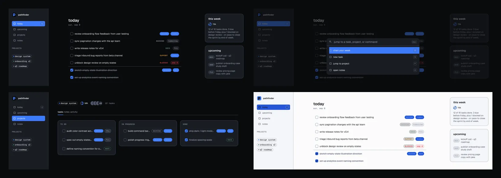
Seventeen components in Figma, nine of them carried into working code, and two composed screens in the published Storybook. The second one filters live on query and tag and hands off to an empty state when the results empty, so the components get exercised under change, not in a fixed snapshot.
What I would not claim
This is a concept system. There were no users, no analytics and no stakeholders, so there’s nothing here to claim about product impact, and I am not going to invent any. What it does demonstrate is whether I can carry a system from a brand decision to shipped tested code alone, measure instead of assuming, and keep an honest record while doing it.
The record is the part I’d point at first. It includes the decisions that were superseded, the arithmetic that had to be corrected, and one occasion where a review was wrong and the original call stood.
Results
- 9 of 17
- Zero
- 195
These are craft measures, not business outcomes. What the numbers describe is whether the system holds together, which is the question this piece is trying to answer.
What I'd carry forward
Everything that failed here passed its own test first. The palette cleared a twelve-pair contrast check and still looked wrong once it was composed into a real screen. The tag colors cleared their check against a dark canvas and then failed ten of sixteen cells the day light mode went live. The mark looked correct at full size and turned to mush at sixteen pixels. Automated checks are excellent at properties you can state about a part, and close to blind on judgments that only exist once the parts are together. Every one of those was caught by a person looking at the assembled thing.
Settle the things everything else sits on top of, first. The brand was the fastest artifact to produce, so it got produced first and treated as finished. Then a Figma library, every component in it, the screens, a favicon and an OG card were all built on top of it. By the time there was enough system to judge the mark in context, changing it meant touching every one of those surfaces. Changing the accent color late cost one commit, because one file owned it. Changing the mark cost a day, because geometry has no equivalent single source.
A stall is information. Partway through the mark I asked for its proportions to be set on a Fibonacci progression, and the tool I was using quit on the request. My instinct was to rephrase it. The right move was to notice that path data was never going to give me constructed geometry, and to hand the work to a program built for it. I lost time to persistence that better routing would've saved.