Case study
Design Under a Deadline
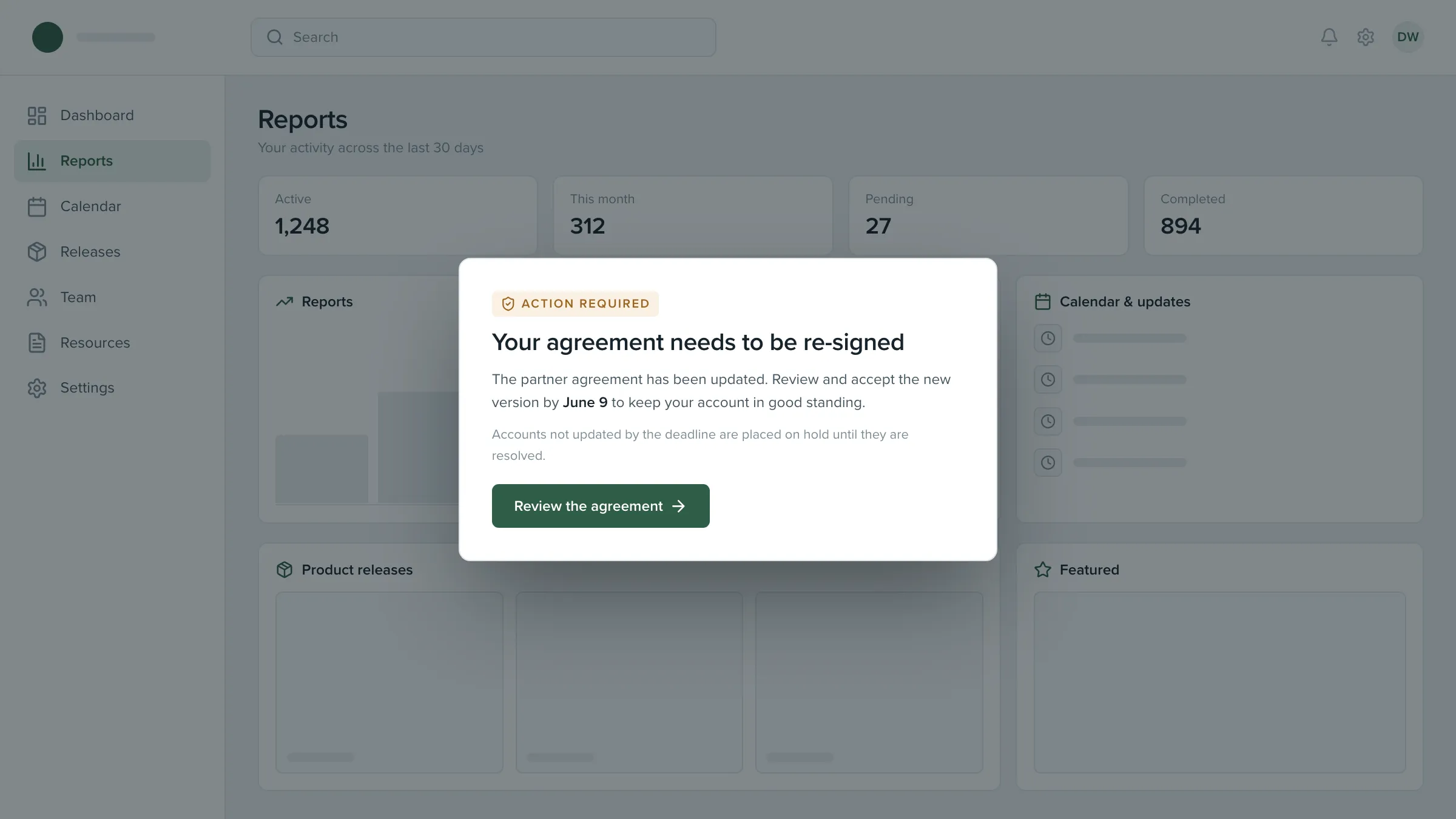
A required agreement update, carried to completion by one in-portal notice with its dismiss button deliberately removed.
The challenge
An updated partner agreement had to be accepted by every active user in one market before a fixed date. Miss it and the account was sanctioned: access gone until the user phoned in to have it restored manually.
So the failure mode wasn’t a lower conversion rate. It was a person losing access to the thing they earn through, because a message was easy to ignore. That reframes the whole problem. This isn’t a nudge, and treating it like one would’ve been the real design failure.
Constraints
Three conditions decided almost everything about the shape of it.
- Scope A fixed date that couldn't move
The deadline couldn’t slide like a campaign date. Everything had to land before it, and there was no version of “we’ll catch the rest next quarter.”
- Technical A fixed component library to work inside
Userpilot ships tooltips, modals, slideouts and checklists, and nothing else. The notice had to be one of those shapes, styled to read as part of the platform rather than a tool bolted on top.
- Scope Real consequences for inaction
Sanctioned accounts could only be restored by phone. Every design decision downstream had to be weighed against that, not against a conversion target.
Approach
The frame I started with.
Most in-app messaging is designed to be easy to dismiss, and that’s usually correct: the cost of ignoring a product announcement is that you ignored a product announcement.
This one inverted that. The cost of ignoring it was losing access to your account. So the question stopped being “how do we make this respectful of attention” and became “how do we make sure nobody arrives at that deadline uninformed.”
Options I considered.
A standard dismissible banner. Respectful, conventional, and it would’ve been read past by exactly the people most at risk of missing the date.
A hard block that held users on the agreements page until they signed. Guaranteed the highest completion number and I argued against it. Forcing a signature is a different thing from making sure someone read the message, and only one of those is mine to decide.
A modal with no dismiss control whose button led to a page the user could still leave. This is what shipped.
The pick and why.
Take away the ability to wave the message away without reading it. Leave the ability to read it and decide not to act. Those are two different powers and the design only takes one of them.
Structure
Three layers, and one way out
Simple on screen, deliberate underneath. Pulled apart, the notice is three layers, and the one that carries the argument is the last: the page the button leads to, which the user can always leave.
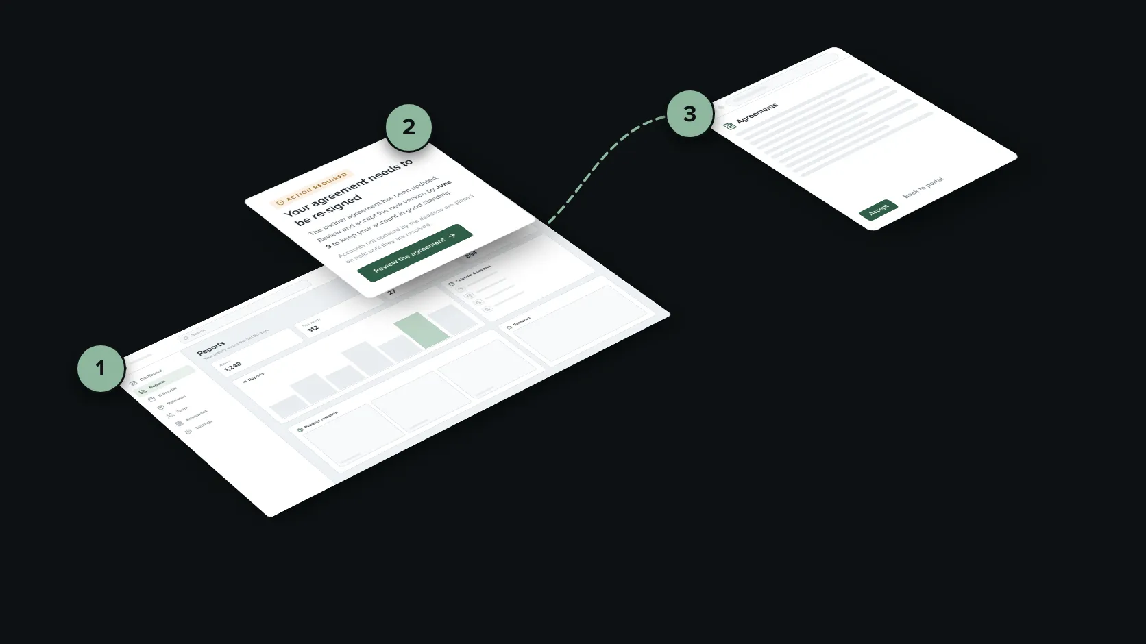
- The portal. The page the user was already on, left where it was.
- The notice. One message, one button, no close control.
- The agreements page. Where the button leads, with a way back out.
Design decisions
One screen, and the four calls inside it
No close control, on purpose. There’s no X, no click-outside-to-dismiss, no “remind me later.” This is the decision I’d most expect to be challenged on, so here’s the whole of it: the people most likely to flick away a notice were exactly the people about to be caught by the deadline, and the consequence wasn’t recoverable by the user on their own. A control that lets someone skip the message in half a second is the wrong control for that.
But the exit stayed open. The single button led to the agreements page. From there a user could read, sign, or navigate away and do nothing at all. Signing remained optional for the entire window. What the design removed was the ability to dismiss the message without ever seeing what it said. It never removed the choice. I wouldn’t have shipped it the other way around.
The consequence stated plainly, once. The notice says what happens if the date passes, in one line, without softening it and without repeating it. People make better decisions with the actual stakes in front of them than with an urgent tone and no specifics. Vague urgency is manipulation. A stated consequence is information.
It re-fired per session, never within one. Someone who chose to leave the agreements page unsigned got the rest of their session back. On their next visit it appeared again. The deadline supplied the pressure, and the notice only made sure nobody reached it uninformed. Nagging within a session would’ve been the tool punishing the user for a decision they were allowed to make.
Played forward, the difference is what each version leads to. The left side is a hypothetical dismissible version of the same message; the right side is what shipped.
- It gets closed without being read
- The deadline passes unnoticed
- The account ends up on hold
- The one button opens the agreements page
- A user can still leave without signing
- Next session, the notice is back
Outcome
Reading the result honestly
Nearly everyone who saw the notice clicked through it. That number tells you almost nothing, because clicking through was the way past it. That was the design working exactly as intended, not evidence that the writing was persuasive.
The number that carries weight is what happened next, on a page nobody was trapped on: roughly three in four of everyone shown it completed the re-signature, more than 15,000 people, while the notice ran. That is a measure of a decision people made freely once they had the information, which is the only outcome this design was entitled to influence.
The rest saw it and hadn’t signed while it ran. Signing stayed optional, so that was an outcome the design deliberately left open.
Results
- 3 in 4
- 15,000+
- 20,000+
Figures are shown as floor values and proportions to respect company confidentiality. Completion is measured from the conversion report for the notice, not estimated.
What I'd carry forward
A pattern isn't ethical or unethical on its own. Removing a dismiss control is indefensible on a marketing prompt and defensible here, and the only thing that moved between those two cases is what happens to the user if they miss it. I'd rather design a screen people can't wave away than let someone lose access to their income because a banner was easy to ignore. What I wouldn't do is reuse this pattern anywhere the stakes are lower, and that restraint is the actual design decision.
Design the escape route before you remove the exit. The part of this I'm most confident about isn't the missing close button. It's that the button led somewhere the user could leave. Removing the ability to ignore a message isn't the same as removing the ability to decide, and keeping those separate is what made the call defensible.
Read your own numbers skeptically. The click-through rate would have looked great on a slide, and it measured nothing: clicking through was the only way past the notice. The number worth defending is the three in four who completed a form on a page they were free to walk away from.