Case study
In-App Guidance for a Platform Migration
A portal tour and its callouts, built in four weeks, and half of everyone it reached finished it end to end.
The challenge
A whole user base was moving to a new portal. Everything people already knew how to do had changed address, and the things worth doing first were a few clicks deep. When a platform launches and the value moment isn’t on screen one, you lose a chunk of users between the door and the place they figure out why they’re there.
Engineering was busy building the platform, so guidance had to ship without competing for their time. I owned that layer end to end inside Userpilot, in a four-week window, having never built a system in the tool before.
Constraints
Four conditions shaped the work before any design started.
- Technical The tool ships a fixed component library
Tooltips, modals, slideouts, checklists. No inventing new UI. The experience had to fit those shapes or not exist.
- Scope Strict brand fit on a tool with its own look
Userpilot’s defaults look like Userpilot. The platform had to feel like ours, which meant deep custom styling on every surface plus voice work on the copy.
- Technical Targeting and triggering were the real puzzle
Firing the right surface on the right page for the right user in the right state. A tour that triggers on the wrong screen is worse than no tour.
- Resource First real system build in the tool
I’d used it casually but never built a system in it. The first few days went to ramp, the rest went to the build, inside a four-week window.
Approach
The frame I started with.
Get users to the value moment fast, then get out of the way. Guidance is a cost you charge the user for a benefit they haven’t received yet, so the bill needs to be small and the payoff immediate.
That framing is why nothing here runs long. The tour ends when it has done its job rather than when it has covered the product.
Options I considered.
Build the onboarding directly into the app. More control over the experience, but four weeks wasn’t enough runway for engineering to ship that and the platform itself.
A video walkthrough. I rejected it for two reasons: video is passive, and it’s hard to instrument against actual behavior. I wanted to know if guidance was working click by click, not “did they watch the thing.”
Build the system inside Userpilot. It let the design ship without competing for engineering time, and every step was measurable.
The pick and why.
Everything in Userpilot, styled to disappear into the platform. One custom theme underneath every surface so guidance never reads as a bolted-on layer, and targeting decided per surface rather than per user count, because a first-timer landing on the home screen and someone returning to a page they got stuck on need different things.
Design decisions
The portal tour
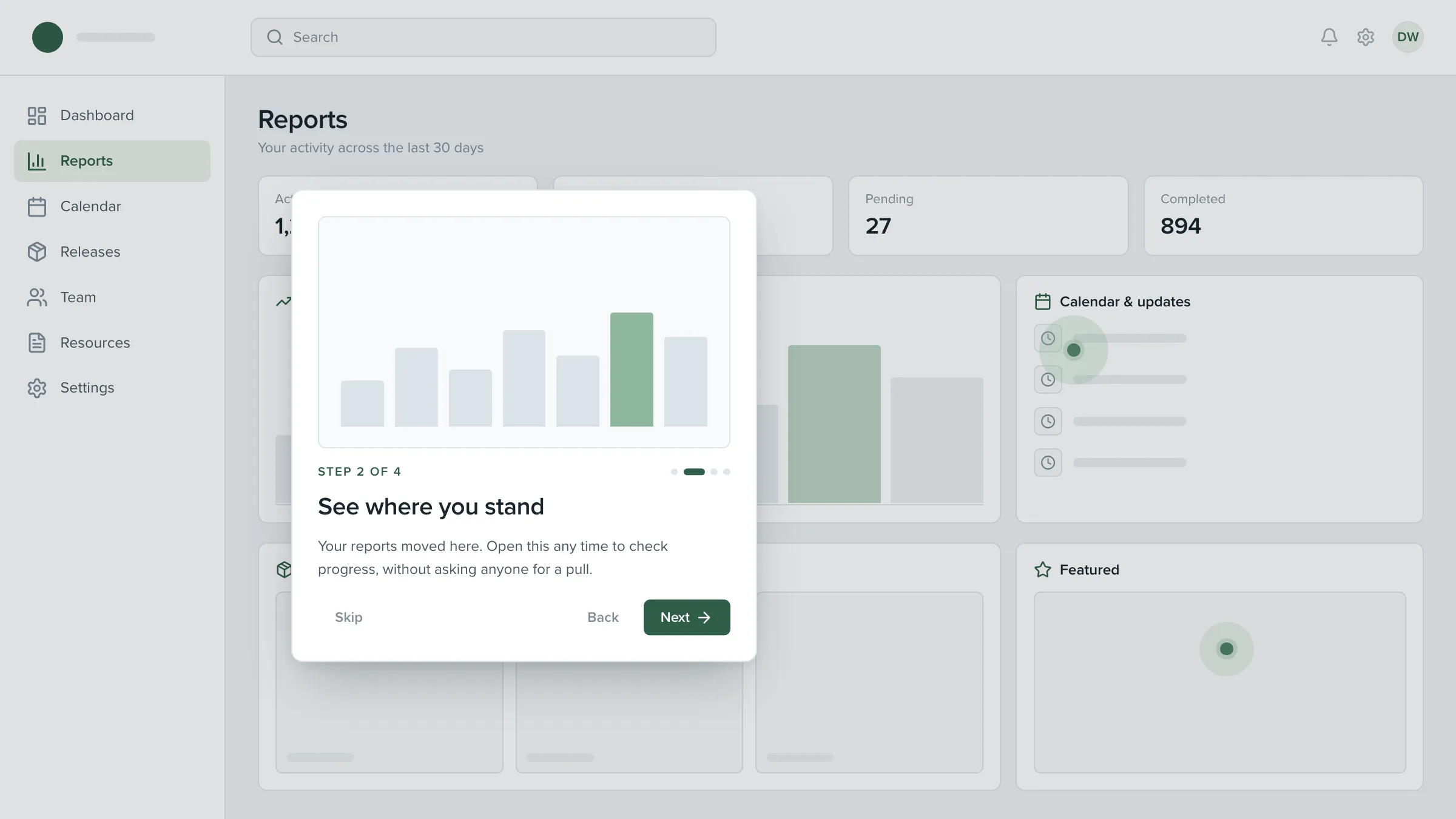
A short tour plus a handful of on-page callouts, aimed at everyone arriving on the new portal for the first time.
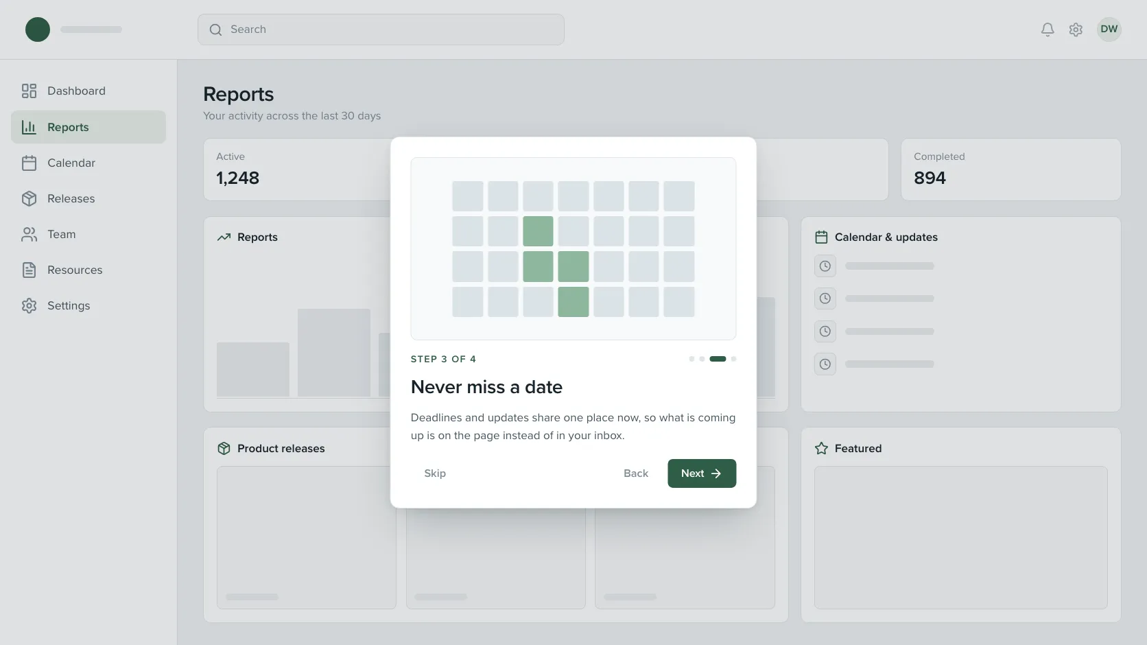
Short, and it ends at the first value moment. Four steps. The tour stops the moment users reach the thing worth doing, not when they’ve seen every feature. The longer the tour, the more the data shows people checking out, so I designed against my own urge to be thorough.
Opt-in entry, not an ambush. It opens with a short modal naming what’s about to happen and starts only when the user confirms. Auto-triggering into step one would have been faster to the value moment. I went with the modal because consent matters early: users who agree to a tour pay attention to it, and users who get one shoved at them dismiss it on principle.
Re-launchable from the help menu. The tour can be restarted any time. I rejected “dismiss it forever” because people learn a platform in waves. What’s confusing on day one is obvious on day three, and the reverse is also true. Treating the tour like documentation felt more respectful than treating it like a one-shot pitch.
Copy rewritten from feature-forward to outcome-forward. First-draft step copy described what the platform did. I rewrote every line to describe what the user got to do. “This is the projects panel” became “Start your first project here.” Small on each line, large across the whole flow, because outcome-forward copy answers the only question the user is actually asking.
Design decisions
Pointing at one thing at a time
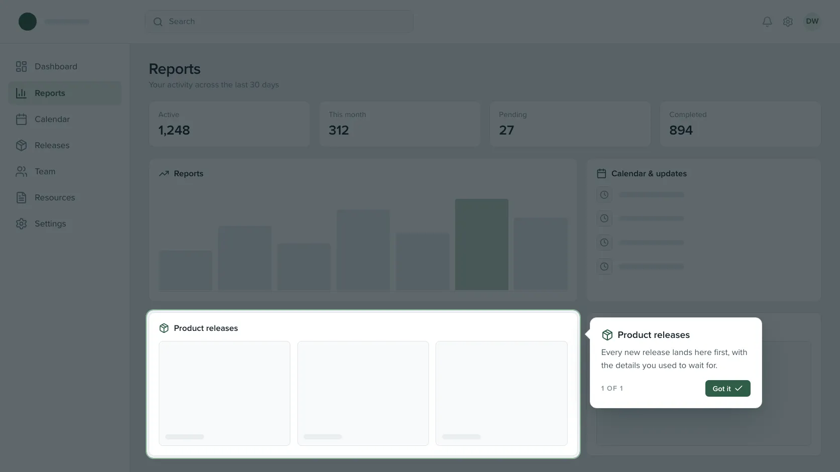
Alongside the tour, single callouts could light one region of the page and explain it. Same theme, much smaller ask.
One target, fully out before the next. Each callout dims the page, lights exactly one region, and anchors a tooltip beside it. When it’s done it fades out completely before another can appear. Chaining them so they slide from region to region was tempting and reads as clutter. A callout that travels is a callout you stop trusting.
Targeting on two signals. How many sessions deep the user is, and what page they’re on. New session on the home screen, tour fires. Return visit to a specific page, that page’s callout can fire. I considered richer segmentation by role and behavior, but two signals turned out to be enough, and simpler logic was far easier to debug. Most targeting bugs in this tool come from the targeting layer, not the UI.
Results
- 1 in 2
- 45,000+
- Reusable
Reach is shown as a floor value to respect company confidentiality. Completion is the measured first-month rate from Userpilot analytics.
What I'd carry forward
Restraint outperformed coverage, and the completion rate is the evidence. The tour stops at the first useful thing rather than touring the product, and I had to design against my own urge to be thorough to get there. Every step past the value moment is a step where the data shows people leaving, so the tour that covers less is the tour that gets finished.
What I'd do differently: define activation rigorously before designing flows. The value moment was clear enough to design against, but I shipped without a one-sentence definition like 'activated means user X did Y within Z minutes of first session.' A sharper definition would have made instrumentation cleaner and given the team a more honest read on whether the work was working.
The biggest lesson about the tool itself: targeting is the design surface, not the UI. I went in thinking the design lived in the tooltips and modals. It did not. Two signals, session count and page, decided who got the full tour and who got a single callout, and those two decisions shaped the experience far more than any styling choice did. The UI was only the delivery layer. Everything I have built in this tool since starts with a targeting map rather than a flow.