Case study
Back in Stock Notifications
Sold-out pages turned into over $3M in attributed sales, with one consent architecture across 14 markets.
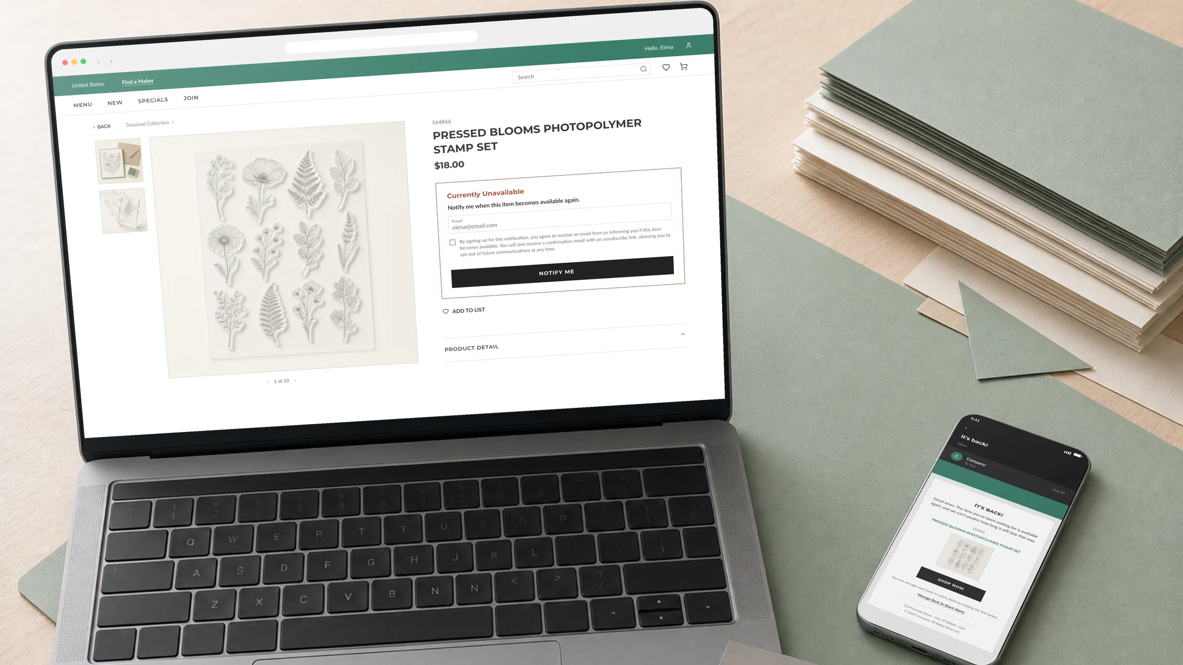
The challenge
Popular products sold out fast, and a sold-out product page was a dead end. Shoppers had no way to know when an item would return, so demand either evaporated or turned into “when is it back” inquiries for support and demonstrators. Leadership asked for restock signups in every market, which turned a simple notify-me form into a compliance problem: consent rules that differed by market, single opt-in where the law allowed it and GDPR double opt-in where it didn’t, all launching at once.
Constraints
Four conditions shaped the work before any design started. All of them were legal or lived next door to it.
- Legal Consent law split the markets in two
A signup was enough in some markets and not others. GDPR markets required a confirmation step, so one system had to carry two consent flows without feeling like two products.
- Legal Consent copy was legal-approved verbatim
Legal dictated the exact wording per market. The design’s job was making dictated text fit a small form gracefully instead of fighting it.
- ScopeTechnical One design for every locale
Layouts were built against the longest translations, and no copy was baked into images, so all 14 markets shipped from a single system with no forks.
- LegalTechnical Data minimization
The form could capture an email address and consent, nothing else. No account requirement at signup, no extra fields riding along.
Approach
The frame I started with.
Open restock signups in all 14 markets, from the sold-out product page, without killing the signup with legal friction. The form itself was the easy part. The real question was where the double opt-in lives so the flow stays honest for a shopper following one product or ten.
Options I considered.
A third-party notify widget could ship fast, but it meant someone else’s UI on our product page and someone else’s data handling under our GDPR obligations. Rejected.
Per-product confirmation emails were the safe default. Legally airtight, but a shopper following five products gets five confirmation emails, and the flow reads as broken exactly when someone likes us most.
The third option restructured the problem: confirm the shopper once, then give every subscription a shared home.
The pick and why.
One confirmation per shopper in the markets that require it, backed by a subscription maintenance page everywhere. GDPR is fully satisfied, since the address is verified once and withdrawal is clearer on a page than in an email footer. Engineering carries one verification state per shopper instead of one per subscription. And the shopper gets something no confirmation email provides: a place to see everything they’re waiting on.
The pivot
The page that made the flow work
Nobody asked for this page. It came from a question I hit while mapping the opt-in states, one the brief had no answer for: what does a shopper who follows five products actually see? I designed it and pitched it. It landed because it made engineering’s opt-in work smaller instead of larger, which is usually what decides whether a mid-project idea survives.
- A confirmation email for every product followed
- Unsubscribe buried in email footers
- No way to see what you're waiting on
- One confirmation per shopper, ever
- Unsubscribe one product or all of them, in place
- Every followed product on one page, linked back to the store
The page turned a legal requirement into a feature shoppers actually use.
Solution
Four surfaces, one flow
The system is small on purpose. Each surface has one job, and the flow hands off cleanly between them.
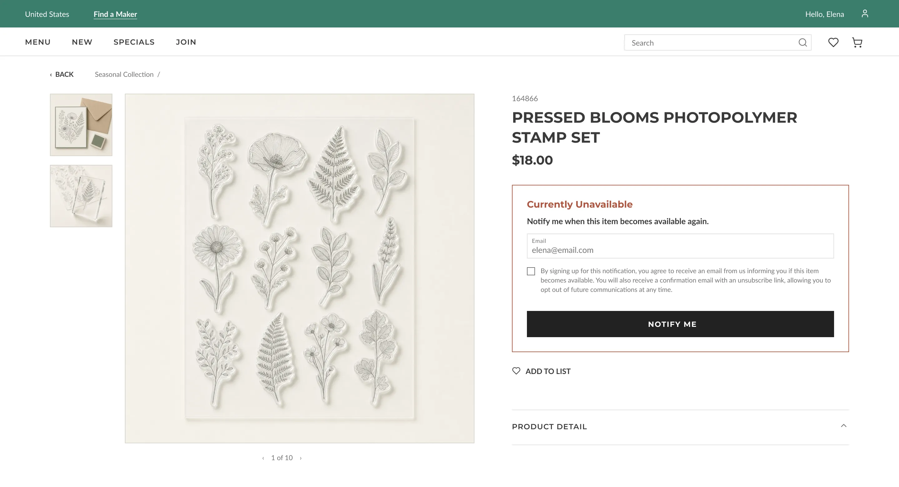
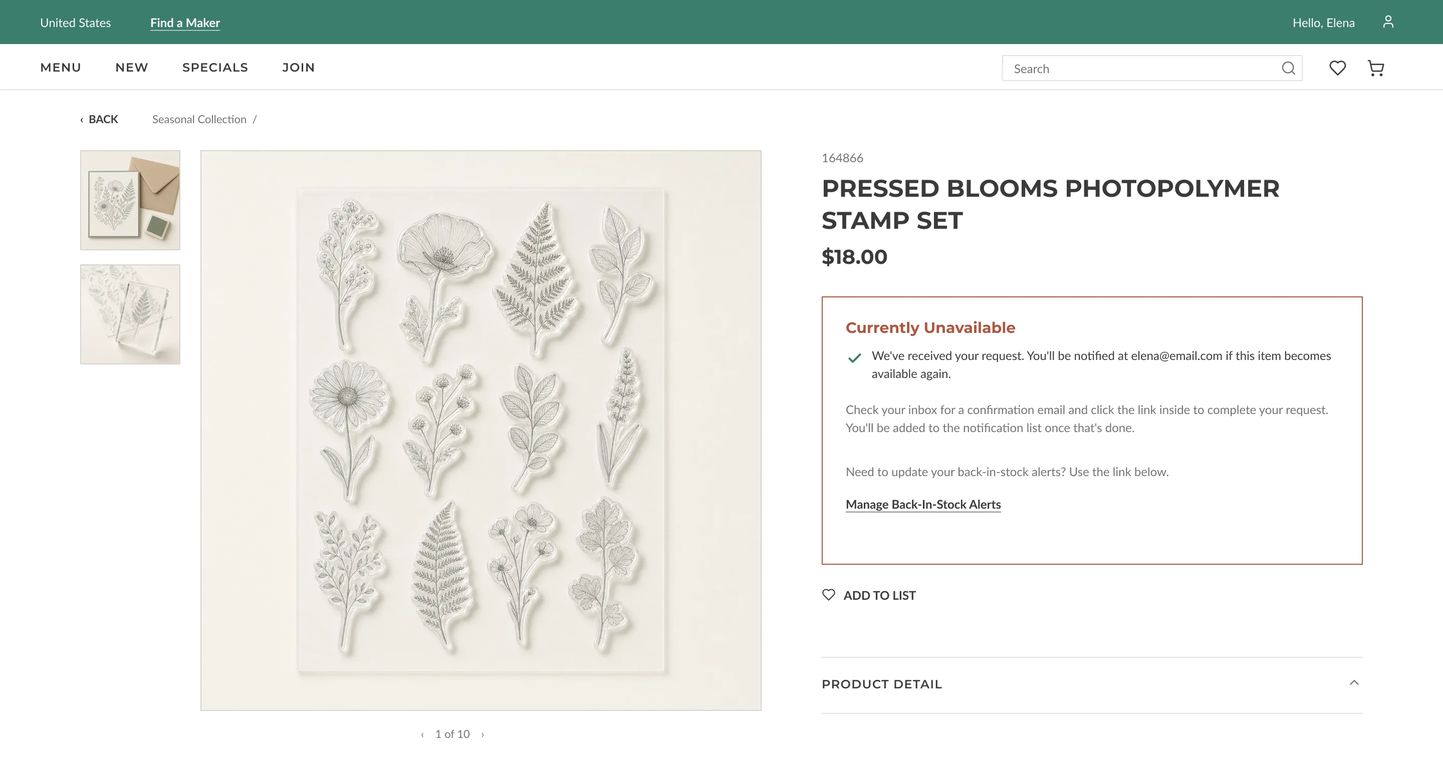
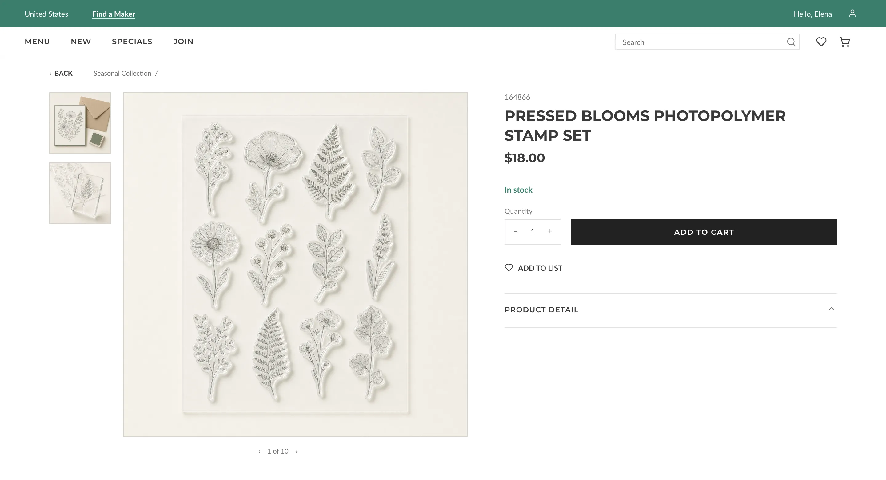
- The sold-out state
Where Add to Cart would be, the page swaps in a compact email field, the legal-approved consent checkbox, and a notify button. The ask lives exactly at the moment of intent.
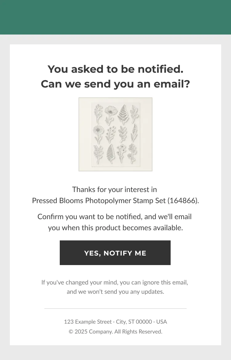
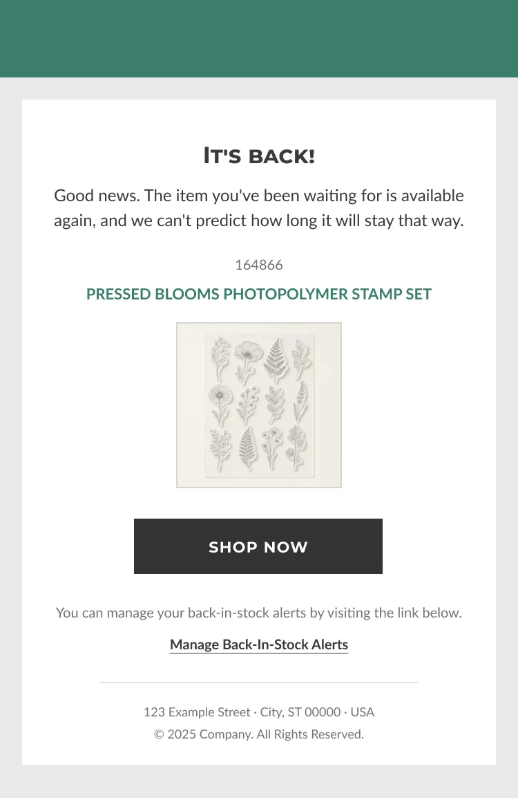
- The confirmation email
One button, one job. Clicking it verifies the address and lands the shopper on the maintenance page. No marketing content riding along.
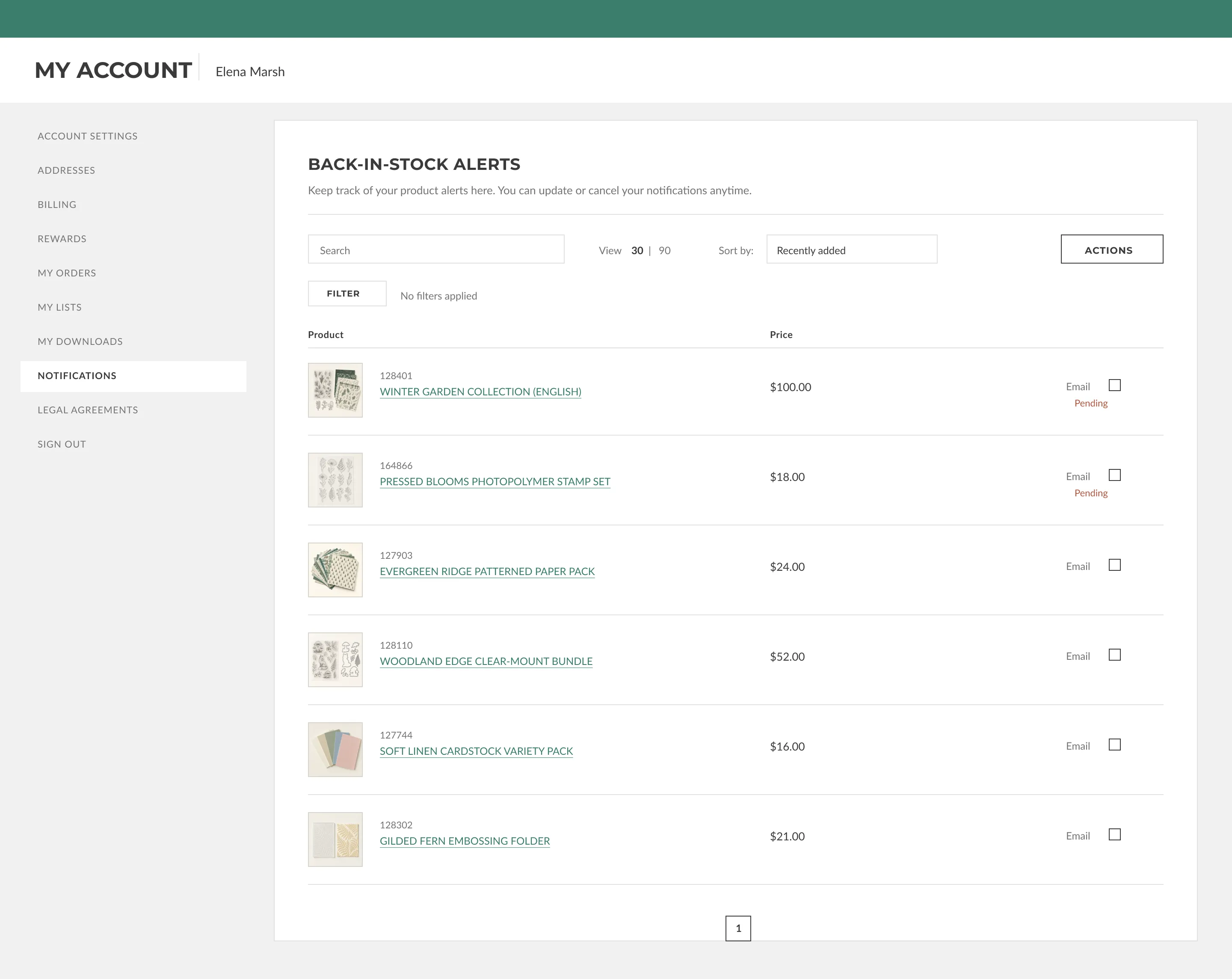
- The maintenance page
Always accessible from the shopper’s account: every followed product with imagery and links back to its page, unsubscribe per product, or unsubscribe from everything in one action.
- The restock alert
The news first, then the product and one button straight back to its page. Speed to purchase is the whole point of the email.
The journey
Sold out to back in stock
Two consent regimes, one system. The rail splits by market and re-merges at the maintenance page.
Handoff
Built from the file
The whole system shipped to the dev team as a dev-ready Adobe XD file paired with an Azure DevOps card carrying the specs.
- States Every state designed Sold-out form, submitted, confirmed, and error states, plus both emails and the full maintenance page.
- Locales Longest translation first Layouts proven against the widest market copy, so no locale broke the design after handoff.
- Card Specs where dev works The Azure DevOps card held the behavior spec, so the file and the ticket never disagreed.
One file, one card, no redlines. The build matched the design because there was nothing left to interpret.
Results
- $3M+
- 14
- 1
Revenue is shown as a floor figure to respect company confidentiality. Structural facts (markets, flow) are exact.
What I'd carry forward
Compliance can improve UX. The maintenance page only exists because GDPR forced the double opt-in question, and answering it well produced a feature shoppers actually use. Treating legal requirements as design inputs, not footnotes, is the lesson I reuse most.
Small surfaces carry real revenue. A sold-out product page is the kind of screen most teams never design at all. Giving it one deliberate state turned abandoned demand into a channel that has attributed over three million dollars in sales.
Pitch the gap you find. The maintenance page came from a question nobody had asked yet: how would a shopper subscribed to five products even know? Raising it mid-project changed the architecture, simplified engineering's opt-in work, and made the whole system hold together.