Case study
Customer Email Program
A welcome program built from zero sends to a seven-figure revenue line, with consent and infrastructure built from scratch across 14 markets.
The challenge
The company had no email marketing program at all: no campaigns, no welcome emails, no automated sequences sent to the tens of thousands of contacts on file. There was no way to reach a buyer after the sale, or a visitor after they left. The existing list couldn’t be reused either, since there was no proper consent on file and EU markets required explicit GDPR opt-in.
Constraints
Four conditions shaped the work before any design started. None of them moved.
- Legal GDPR compliance across 14 international markets
Forced an explicit double opt-in flow and killed any shortcut imports.
- Legal Tens of thousands of contacts with no proper consent
The existing list couldn’t be migrated. The program rebuilt from zero.
- Technical · Scope No prior email infrastructure or owned channel
Vendor selection, deliverability setup, and consent management landed in scope before any design work began.
- Resource Limited internal email-marketing expertise
I partnered with a specialist and focused on experience design and storytelling rather than deliverability.
Approach
The frame I started with.
Where are visitors already most engaged with the brand, and how do we meet them there instead of interrupting them? Signup placement was the lever. The welcome series only matters if people sign up in the first place.
Options I considered.
- Single footer form. Low friction, low capture.
- Multi-channel touchpoints across blog, checkout, and footer. More complex, but matches where customers actually engage.
- Gated lead magnet alone. High capture, but narrows the audience to download-seekers.
The pick and why.
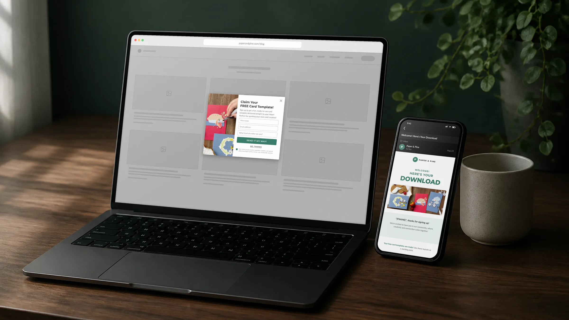
Multi-channel touchpoints, weighted by intent. Each placement matches a different moment of engagement: blog exit-intent for casual readers, checkout for high-intent buyers, footer as the persistent fallback.
Discovery
What the data told us
- Blog High traffic, high bounce Visitors read and left without acting. Strong case for an exit-intent trigger.
- Checkout High intent, low friction Capturing a subscriber feels like a natural next step after a purchase.
- Footer Always on Present on every page. The catch-all for everyone else.
Three engagement patterns, three placements. The signup system meets people where they already are.
Research
What competitors weren't doing
Competitive analysis across crafting and e-commerce brands showed the same gap everywhere: signup treated as a form, not a moment.
- A single footer form, no welcome sequence behind it
- Email address only
- Multi-market consent unsolved
- Three placements weighted by engagement intent
- Name, language preference, and signup source captured up front
- Explicit double opt-in cleared in all 14 markets
Capturing language preference up front mattered most. Personalization at scale falls apart without it.
A/B Testing
The test
We tested a free downloadable craft project against a control offering just the signup confirmation on the blog pop-up. The incentive version substantially outperformed on signups.
That result shaped the welcome series architecture. Pop-up signups get Email 1a with the download link. Footer and checkout signups get Email 1b without it, and both paths merge at Email 2. It gave leadership something concrete to point to, and it kept the series honest: download signups got exactly the project the pop-up promised.
Solution
The welcome series
Four emails, each one earning the next.
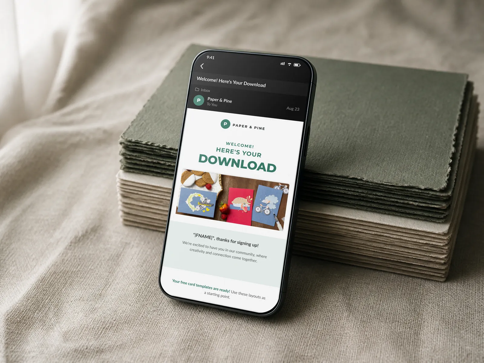
- Email 1 · Welcome. Warm brand intro. Download for pop-up signups (1a); same welcome without it for footer and checkout signups (1b).
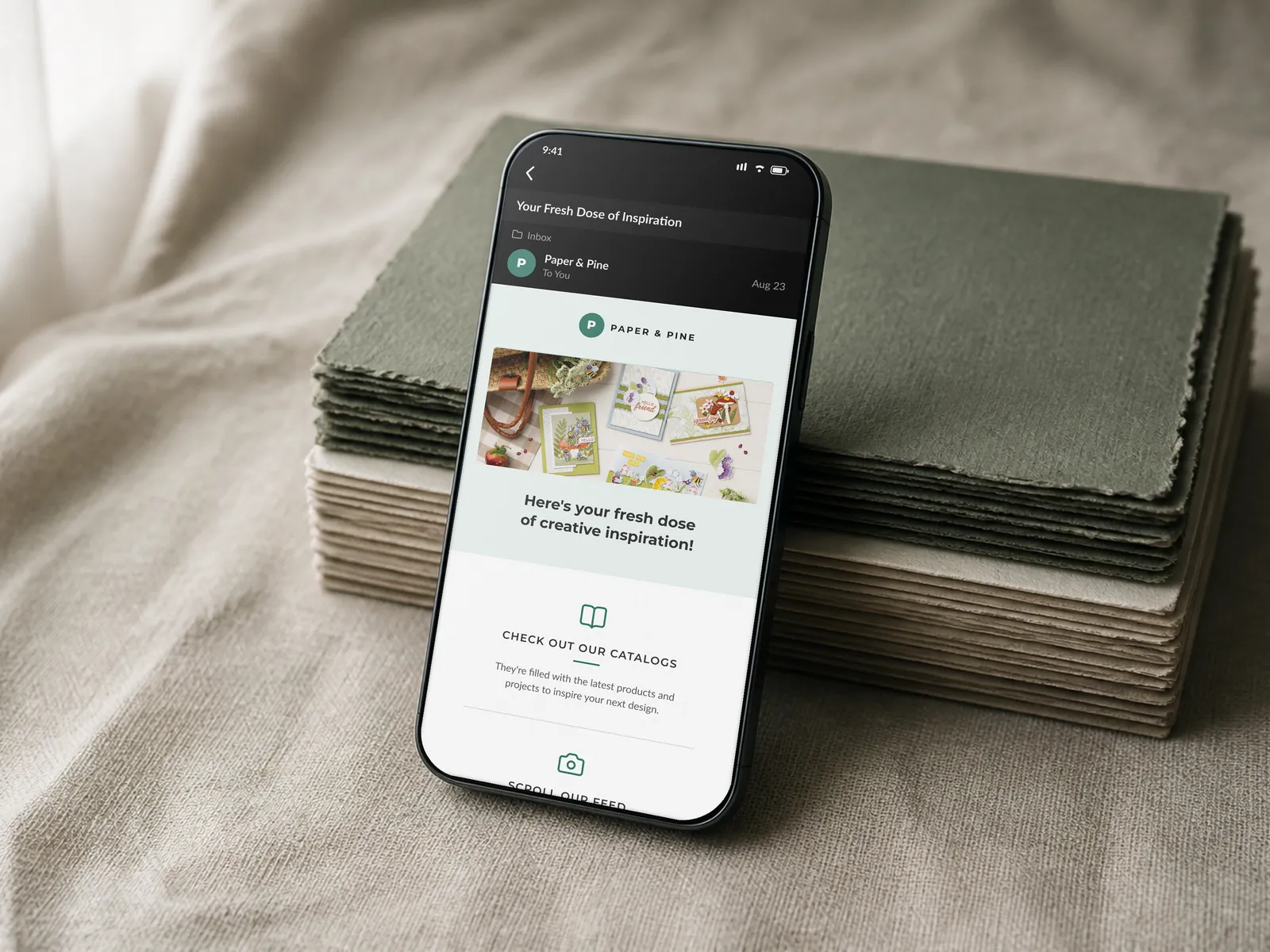
- Email 2 · Get Inspired. Project ideas and techniques that build confidence and excitement, no products yet.
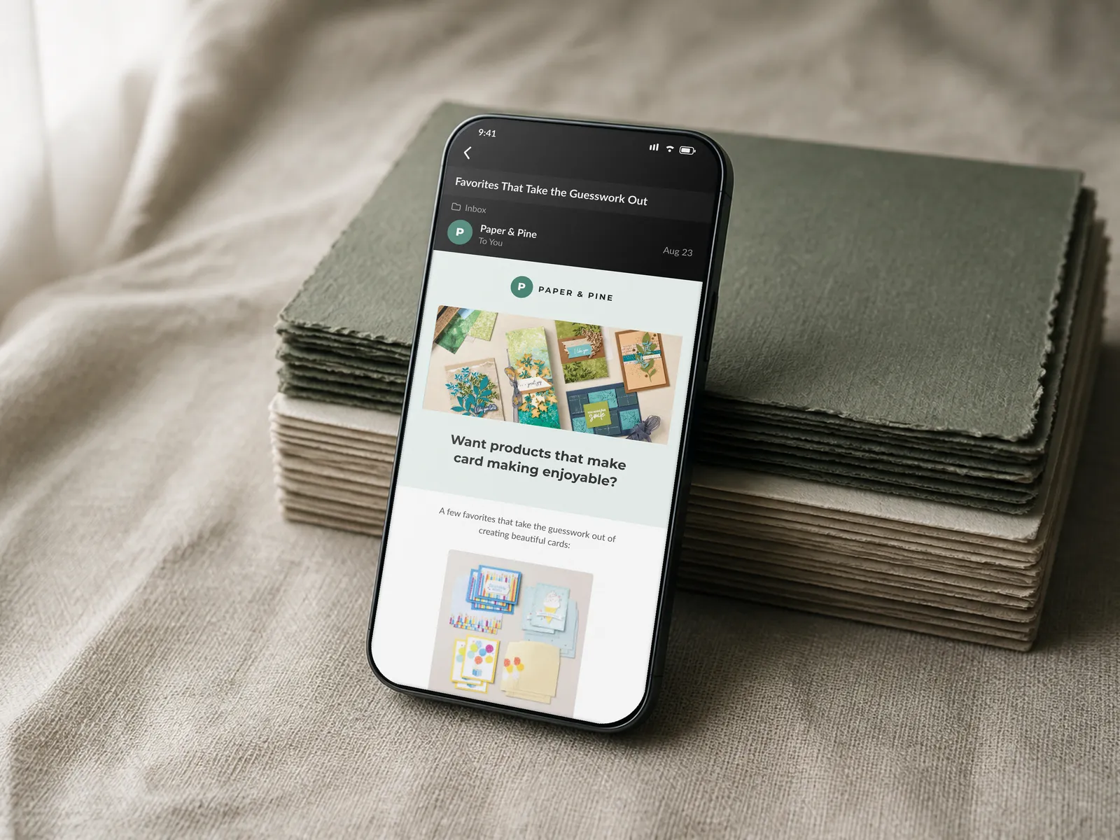
- Email 3 · Products. Curated tools and materials, framed as recommendations once the brand has earned that context.
- Email 4 · Community. Real crafter stories and an invite to join, once the first three have earned it.
System Diagram
How it all connects
Three signup sources, one consent layer, two welcome paths that merge into a single four-email arc.
Visual Gallery
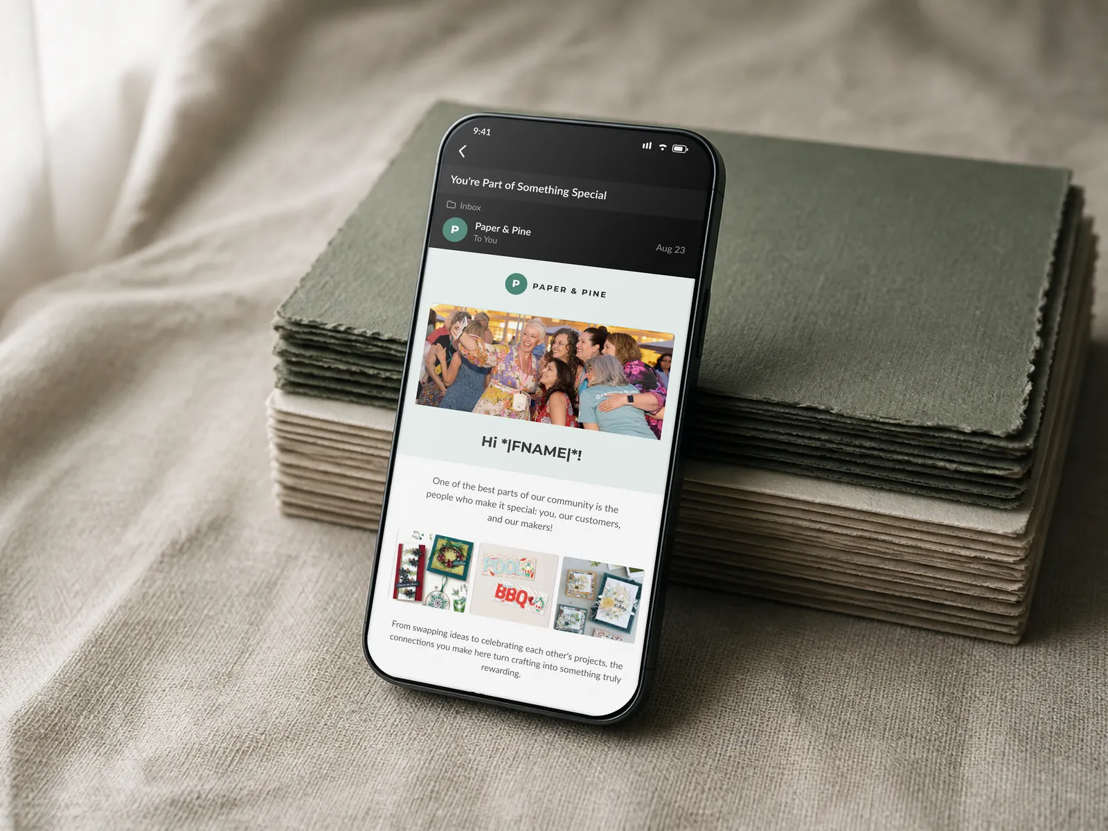
Welcome series previews
Four emails, four moments, each designed with a specific subscriber state in mind. Each is a faithful recreation of the production template, rebuilt under a stand-in brand to keep the work confidential.
Results
- 7-figure
- Thousands
- 14
- 4
Revenue and signup figures are shown as ranges to respect company confidentiality. Structural facts (markets, email count) are exact.
What I'd carry forward
The best UX work isn't always on a screen someone sees every day. Consent flows, signup placements, and a four-email narrative arc. None of those are flashy. But they turned an idle contact list into a channel that generates revenue every week.
What made it work was scope clarity. I focused on experience and storytelling. The email specialist focused on data and delivery. Neither of us tried to own both sides. That division let the work get to a quality level it wouldn't have reached otherwise.
If I were starting again, I'd run the A/B test earlier. We validated the download incentive partway through, which meant the welcome series structure had already been roughed out without it. Running the test first would have let the data inform the architecture from the beginning rather than confirming a decision already in motion.