Case study
Sales Activity Dashboard
A demonstrator sales dashboard designed in full, then redesigned twice: once for engineering feasibility, once when policy changes limited the data.
The challenge
Demonstrators ran their business from static tables: rows of numbers with no sense of trend, pace, or composition. Reading “how am I actually doing this quarter” meant scanning cells and doing mental math. The ask was a visual dashboard inside the demonstrator experience covering personal sales, income, and team commissions. What made it a design problem worth writing about is that the project got hit by two separate constraints after the first design was already done, and the final system is better for both.
Constraints
Four conditions shaped the work. Two of them arrived after the design was finished.
- Technical Engineering couldn't ship the first chart type
The initial design used indexed line charts that the portal stack couldn’t build. Every chart had to be rethought in a form the dev team could actually ship.
- Technical The math differed per tab
Income metrics add up to a true total. Team commission metrics multiply. One chart pattern copied across tabs would have quietly lied about the numbers.
- Legal Policy changes limited the data
Partway through, a policy change restricted which data the dashboard could surface. Parts of the finished design, including the sales-type breakdowns and the goal summary chart, depended on data we could no longer use.
- Scope Release had to be phased
The same policy changes meant the dashboard couldn’t ship whole. We needed a rollout plan, built with the business and leadership, that released what the data supported now and staged the rest.
Approach
The frame I started with.
What does a demonstrator need at a glance that a table can’t give them? Trend, pace, and composition. The chart system had to make those instant, and it had to be something engineering could actually build in the stack they had.
Options I considered.
Fight for the indexed line charts. The strongest version visually, and dead on arrival in the portal stack.
Switch everything to stacked bars. Dev-friendly and honest about composition, but only where the underlying math actually adds.
A hybrid: lines for trend, bars for composition. More expressive, but two chart languages to design, build, and explain.
The pick and why.
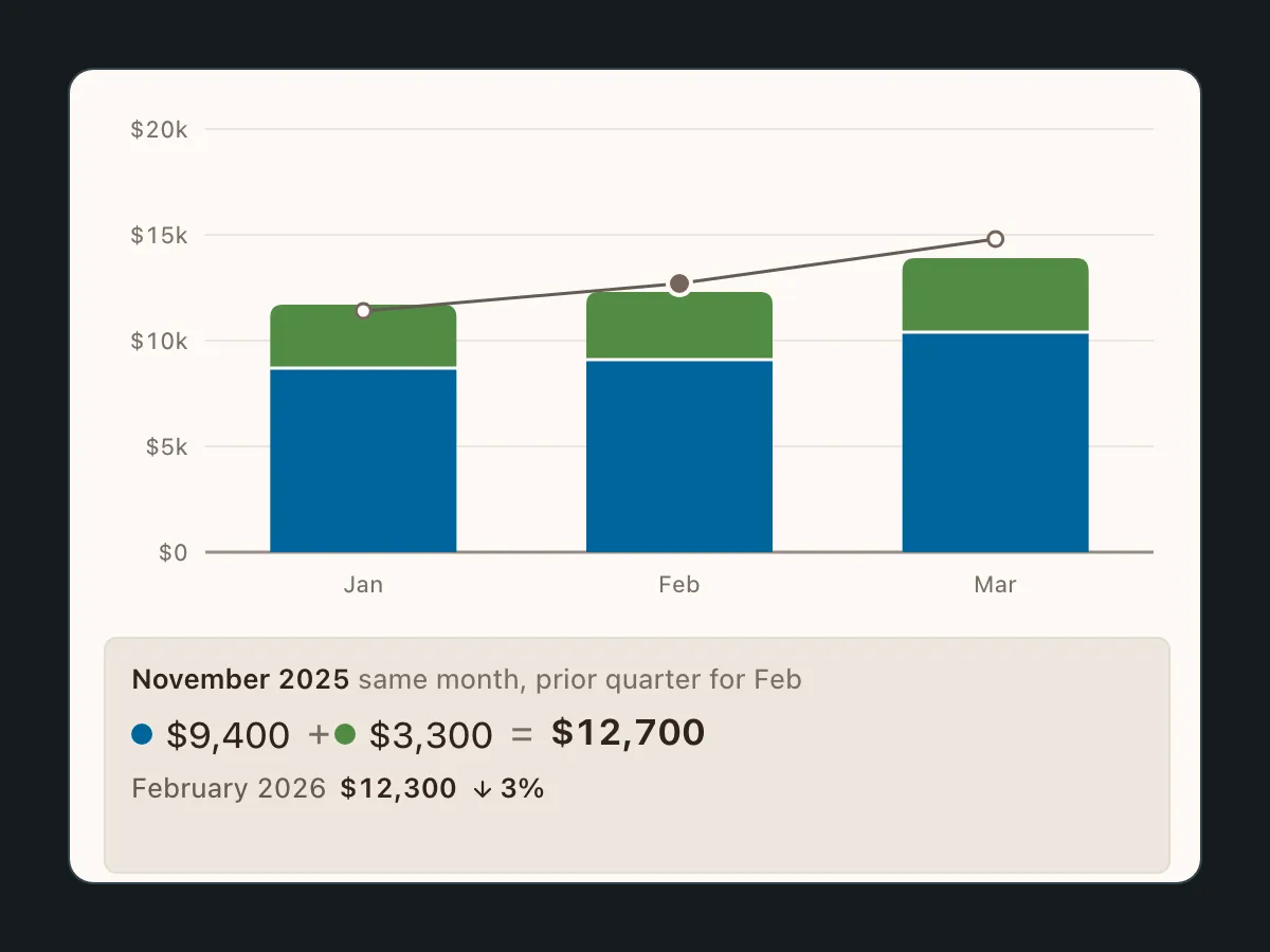
Stacked bars as the single system, adapted per tab instead of copied. Where the metrics add, segments stack to a true total. Where they don’t, the bar stays single-segment and companion pills carry the extra numbers. One visual language, one tooltip system, one thing for engineering to build well.
The tracker
Try it
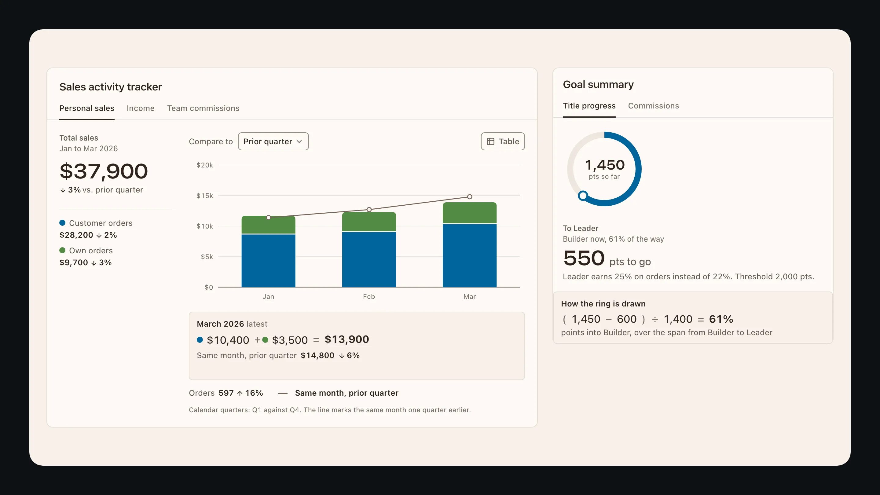
This is the tracker, and it works. Switch the tab, change what it compares to, and hover any bar: the readout under the chart does not just repeat the number, it shows the arithmetic that produced it. Where the math adds, the bar stacks. Where it does not, the bar stays whole and the other numbers ride beside it.
Sales activity tracker
March 2026 latest
$10,400+$3,500=$13,900
Same month, prior quarter$14,800down6%
- Orders
- 597 up16%
- Same month, prior quarter
Calendar quarters: Q1 against Q4. The line marks the same month one quarter earlier.
How it is calculated. Total sales = customer orders + own orders. Change = (this period − prior period) ÷ prior period.
Order count rides beside the bar. It is a count, not dollars, so it does not stack.
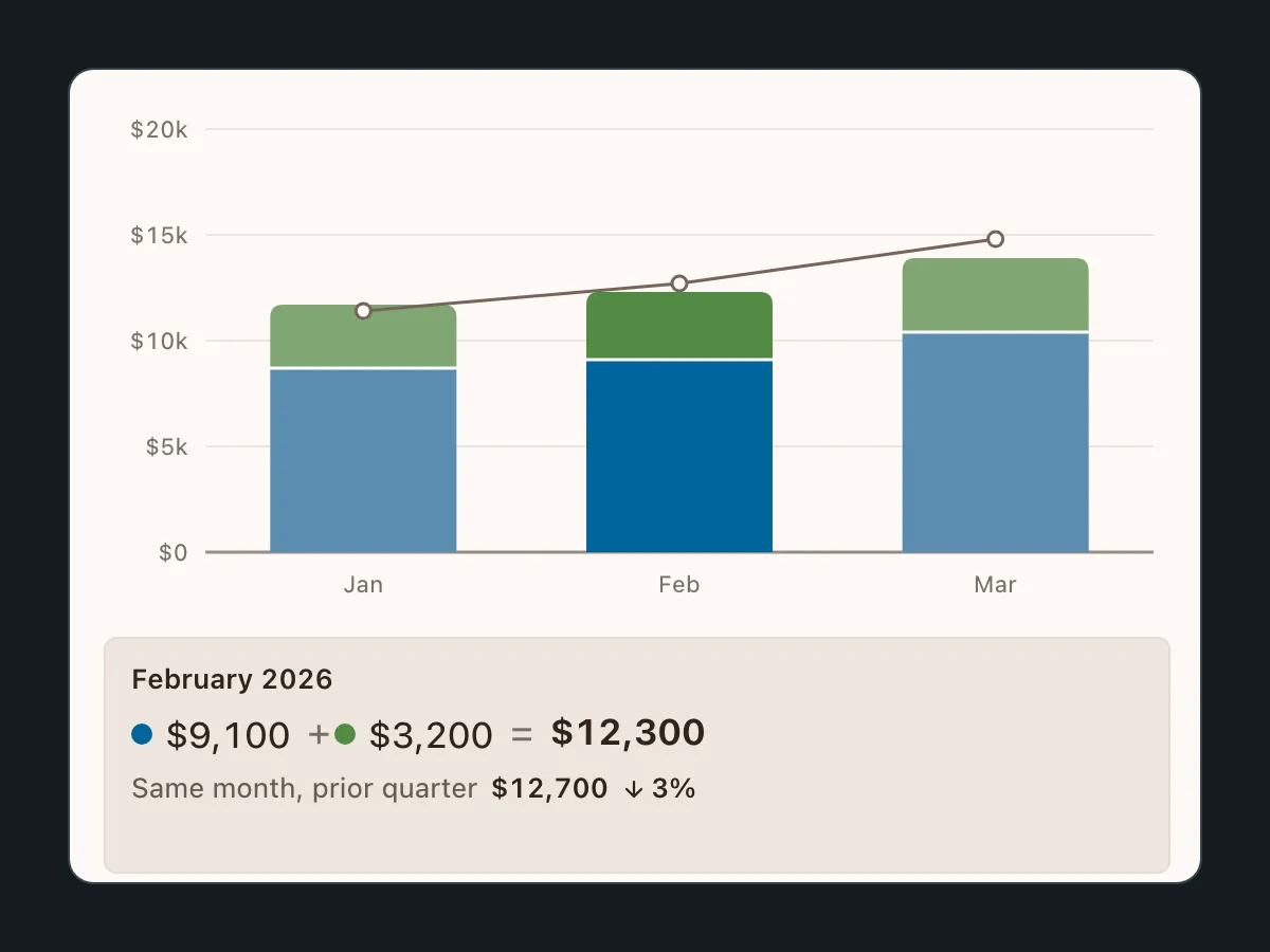
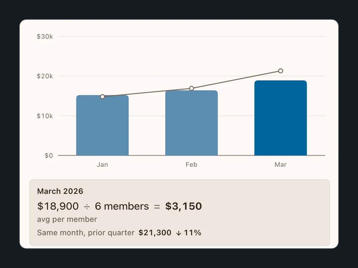
Every bar shows its own math. Hover Personal sales and you get customer orders plus own orders equals the total. Hover Team commissions and you get team sales divided by members equals the average. The shipped tooltip listed values and floated over the chart, covering the bars beside it. A readout that sits under the plot and shows the equation is the step I would take next, and it is the honest version of the “stack only what adds” rule: the chart tells you why it looks the way it does.
A table is one click away. Every chart view has a table view of the same numbers. It is the accessibility floor, and it is also what a demonstrator reaches for when they want to copy a figure into their own spreadsheet.
Goal summary
To LeaderBuilder now, 61% of the way
550 pts to go
Leader earns 25% on orders instead of 22%. Threshold 2,000 pts.
How the ring is drawn
(1,450−600)÷1,400=61%points into Builder, over the span from Builder to Leader
The ring explains itself too. The goal summary was the piece the policy changes cut, so this is the design as intended rather than as shipped. Progress is points into the current tier over the tier’s span, and hovering the ring shows exactly that division. The commissions view lays the ladder out flat so the next rate is never a mystery.
What you see here is the shipped structure and behavior in a look of my own, with an invented business, an invented title ladder, and points instead of the real volume unit.
Design decisions
Keeping every chart honest
The rebuild covered every chart and tooltip state across three tabs and three comparison windows. The decisions below are what kept all of it coherent.
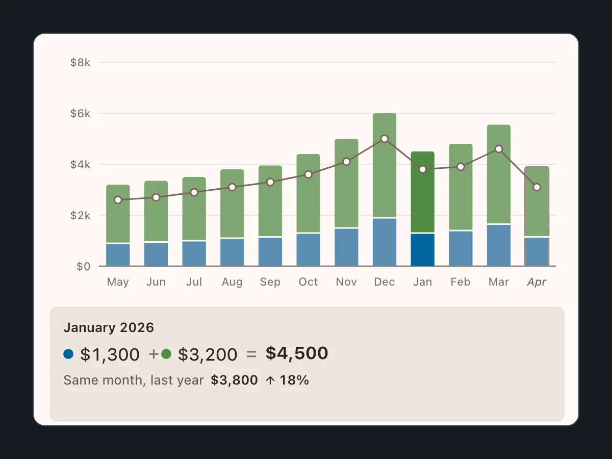
Stack only what adds. Income bonuses and commissions stack because they genuinely sum to total income. Team commission metrics multiply, so those bars stay single-segment. If a chart implies addition, the math underneath has to be addition.
Facts beside the bar, not in it. Order counts, team size and rates matter, but forcing them into the stack would distort it. They sit beside the chart: present, readable, and not pretending to be part of the composition.
One tooltip system for everything. Colored dots keyed to segments, a caret for the hovered bar, and directional arrows for change: green up, yellow down. Every tooltip, one pattern, so demonstrators learn it once.
Honest in-progress months. The current month gets an asterisk on its bar label and an “in progress” note in the KPI subtitle. Partial data should never read as a sudden dip.
Calendar quarters, not rolling windows. The prior-quarter comparison shows Q1 against Q4, because that’s how demonstrators actually think about their business, even though a rolling 90-day window is easier to compute.
Re-scope
Cutting the finished design into phases
The policy changes landed after the full design existed. The sales-type breakdowns and the goal summary chart depended on data the dashboard could no longer surface, so the work shifted from pixels to planning: which views could ship with the data still available, which had to wait, and how to sequence releases alongside the policy timeline. That rollout plan was built with the business teams and leadership. Phase 1 went to engineering dev-ready, and the wider rollout is on hold while the policy changes settle. The plan is what lets it restart without redesigning.
Visual Gallery
The system, tab by tab
Three tabs on one visual language, plus the tooltip pattern that ties them together.
Results
- SVG
- 3
- 3 x 3
- 2
What I'd carry forward
Constraints made this design more honest. The stacked bars that engineering could ship are also truer to the data than the line charts they replaced: where the math adds, you see it stack, and where it doesn't, the chart refuses to pretend. I would not go back to the original design even without the constraint.
Half the design work never touched a screen. Building the phased rollout plan with the business and leadership, deciding what the available data could honestly support in each phase, was as much the deliverable as the charts themselves. The rollout is paused as I write this, and the plan is still the thing that would let it restart.
The thing I'd do differently: pressure-test data availability before designing the complete vision. I designed the full dashboard first and re-scoped after the policy changes landed. Starting with a data audit would have let me design the phases from the beginning instead of cutting them out of a finished design.